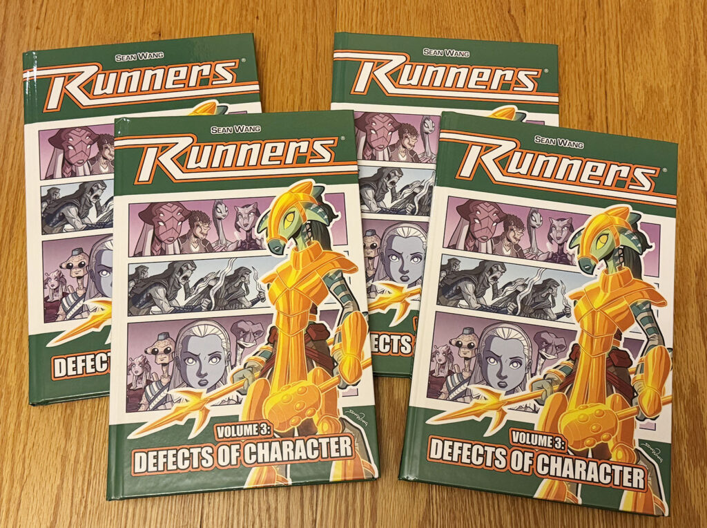
Huzzah! Volume 3 is now available in printed form as an extra long 224-page graphic novel. The books are done at the printer and I should have them by mid-December. You can now order at my Store here on RunnersUniverse for fulfilment starting in January 2026!
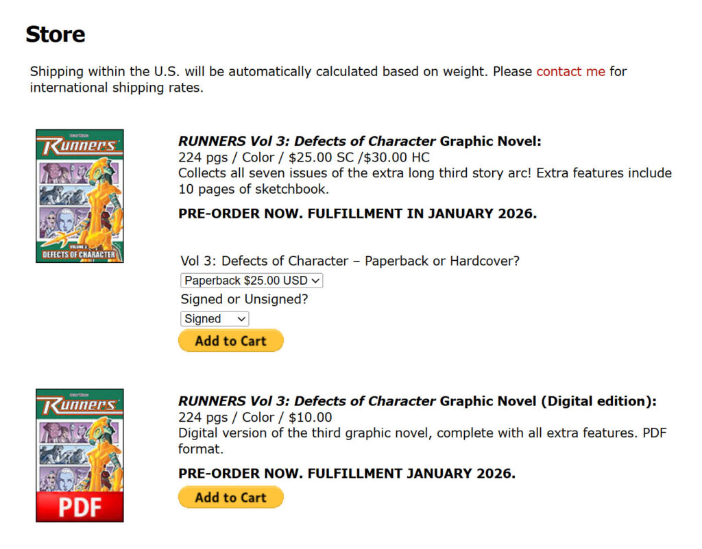
The newest RUNNERS book is now available to purchase in paperback, hardcover, and digital editions!
Last fall, I ran a Kickstarter campaign to fund the printing of the book, and it went extremely well. The physical books have now been printed and delivered, and all Kickstarter orders have been fulfilled. For those of you who do not use Kickstarter, you can now order the book from my RunnersUniverse.com Store.
As always, Volumes 1 and 2 are also available in paperback, hardcover, and digital editions. And you can opt to get your books signed when placing an order.
Just a heads-up: I will be moving this spring, so the Store will be shut down at that point. And I will not be setting up at conventions this year. So if you are interested in getting the new Volume 3, I highly recommend doing it soon through my Store!
Book shipping is around $5 in the U.S. by Media Mail. For international orders, please contact me through the website form, but be warned that international shipping can be quite high.
I am really happy with how this book turned out, and I can’t wait for you to get your copy. I think you’ll love it!
I’m excited to announce that Volume 3 is officially done at the printer and is now on its way to me! It is being printed domestically in the U.S. so shipping should only be around one week. My Kickstarter Pledge Manager is now running through the end of this year (for backers of the campaign), at which point I will start shipping books!
For those who did not back the Kickstarter, you can now PRE-ORDER Volume 3 through my Store here on RunnersUniverse. Assuming the Paypal code works properly. If there are any issues, please let me know. Any pre-ordered books will ship in January 2026.
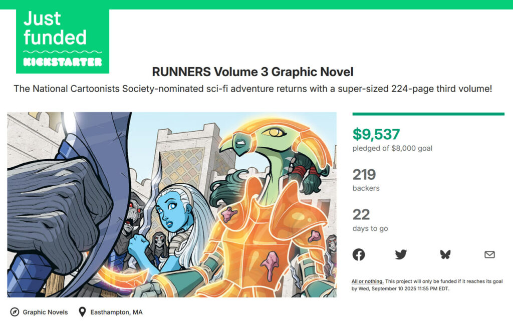
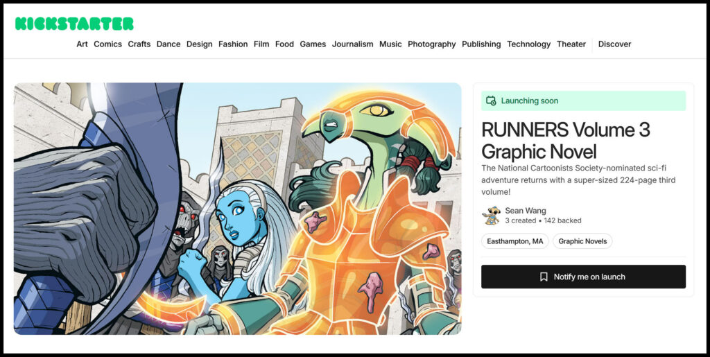
It has been an exciting weekend. First and foremost, the RUNNERS Volume 3 Kickstarter campaign officially crossed the funding goal on day 3!! I am extremely happy about the initial rush of backers and can’t believe we reached the goal that quickly. Hopefully people will continue to discover the campaign for the next few weeks.
As a side note, I don’t think I will be able to do much on the convention circuit in the coming year (or more), so if you are interested in picking up Volume 3, the Kickstarter will probably be the best way to do it. I will also be listing it on my store afterwards, but conventions might not be much of an option.
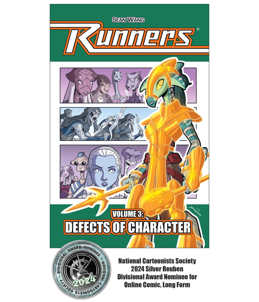
In addition to that exciting news, I was also in Boston last week attending the 79th Annual Reuben Awards, where I was nominated for the Divisional Award of Best Online Comic – Long Form! The award ended up going to David Milgrim, a local friend of mine who also happened to be nominated in the same category. Congrats, David!
While I didn’t win, it truly was amazing for the series to be recognized with a nomination, so I am very happy about that. Plus, I got to spend a nice weekend in Boston with my wife Peggy, and I even got to get spiffy in a suit for the night.
At the Reuben Awards with friend, fellow nominee, and WINNER David Milgrim!
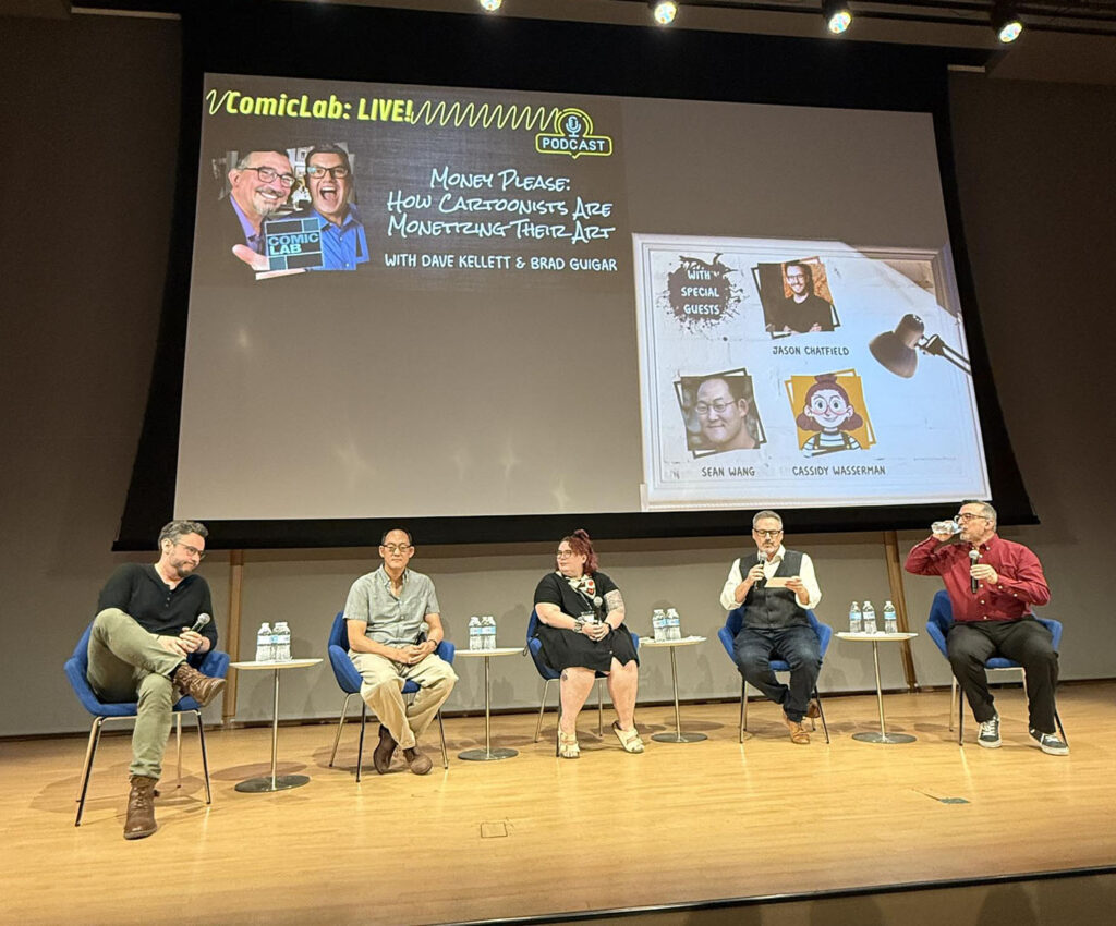
While in town for the Reubens, I also got to join Brad Guigar and Dave Kellett for a live recording of their awesome podcast Comic Lab, which I highly recommend. We were joined by Cassidy Wasserman and Jason Chatfield for a great talk on making money in comics and cartooning, but it also touched upon many other topics. Look for that episode to post in the coming weeks.
Joining the Comic Lab podcast
It was a fantastic weekend, but now it’s back to work. Don’t forget to check out the Kickstarter campaign, which runs until September 10, and keep spreading the word!
You can now get the collected graphic novel of RUNNERS Volume 3, as well as Volumes 1 and 2, in both print and digital editions. There are also Add-Ons for other RUNNERS goodies and some very limited quantities of certain items, like my TICK issues. Back the campaign early to make sure you don’t miss out on any limited add-ons.
I am still working on the actual campaign page, which I am looking to officially launch in early August. But in the meantime, you can visit the pre-launch page and sign up to be notified. As always, getting lots of backers early on is really beneficial for a campaign’s success, since it shows a strong likelihood of getting fully funded, so I hope you will sign up now and pledge early when it launches.
And as always, please help spread the word! It’s been a long road getting this volume done, so I’m very excited to finally be at the stage of getting it printed and into your hands!