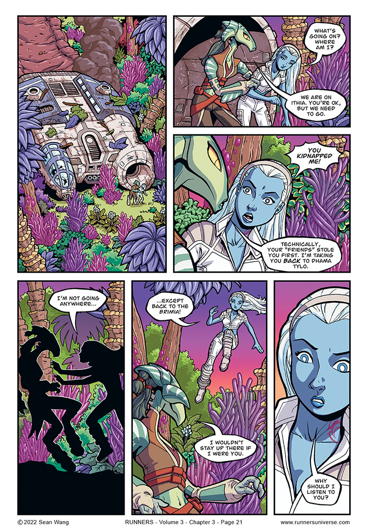
For the next few pages, which take place on an alien planet, I ended up doing a major round of art revisions after the pages had been completely colored and done. With the original version, Wes did a great job coloring and I did a slight second pass to tweak some of the plant colors, but I still didn’t quite like it. The problem was that in wanting to show lush alien plant life, I had penciled and inked a bit TOO much variety (different plants, different colors, etc), and consequently, the planet did not look very distinctive. I decided that for a sci-fi planet, it’s better to just select a few signature forms and stick with those to give the planet a much more uniform and memorable aesthetic. So I went back and redid a fair amount of the backgrounds.
I will do a comparison post later that shows the original art versus the new. While I did like some of different plants in the original version, I think the new version, with a greater emphasis on the tube-like, sea-anemone-ish plants works much better.


Nice colourful world! I was distracted by it at first, like I didn’t notice the ship has crashed.
Interesting premise also, are we going to see the Runners version of Enemy Mine (1985)?
Or that one episode of Star Trek with Geordi and the Romulan.
Great. Now I’ll just be hearing Louis Gossett Jr’s voice coming out of Jayd!
Did Jayd know Sky could fly before this? Yes, right?
Those mysterious blue robed guys on the planet where the Brimia was picking up scrap saw her and they would have got the word to Jayd or am I assuming too much?
Either way, she doesn’t seem too concerned about Sky just supermanning away.
What’s the over/under on what’s coming to get sky:
Carnivorous vines?
Furious insect swarm?
Lightning strike?
Low flying helicoper?
A straight-up Dragon?
The true danger of any lush alien planet….hay fever and allergies!