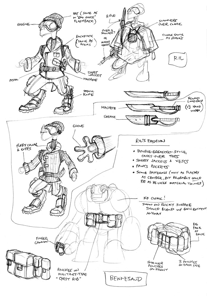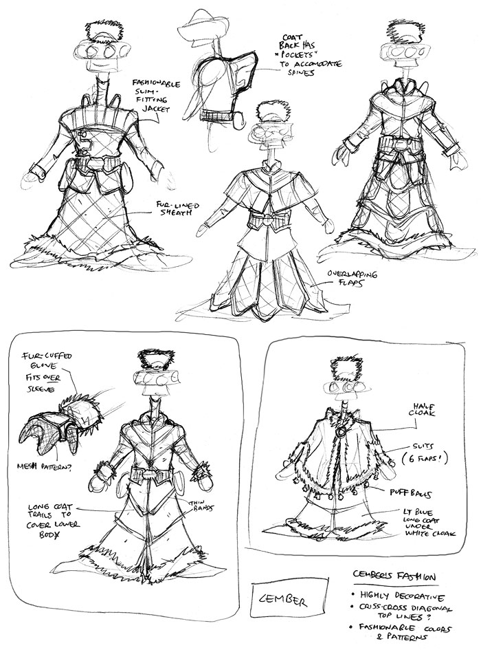
I settled on Ril’s outfit pretty easily (I love when that happens!). Different textures are important to me in terms of adding variety to outfits, so for Ril, I thought a fine vertical ribbed pattern would be a nice way to make his outfit visually different. And, as mentioned earlier, that ribbed look was also derived from his hat, which had already been established in the flashback sequence from Bad Goods.
For Bennesaud, I wanted to give him a little something for this story arc in the form of a belt of pouches. I very briefly considered a bandolier across the torso, but quickly decided that that would be too Chewbacca. I always liked the look of military pouches across the stomach, so that pretty quickly became Bennesaud’s look.
To make Bennesaud’s belt a little more visually interesting (to me, at least), I made the pouches different sizes, so there’s one big pouch on the back, three small ones in the front, and three medium-sized ones on either side. The idea with the really big pouch is that maybe Bennesaud keeps Cember’s snow cloak in there for him since Cember doesn’t have his own bag in this arc. Not really sure the cloak would all fit in there, but that was the intent.
Additional notes for Ril can be found in the commentary for The Big Snow Job #2, Page 1.
Additional notes for Bennesaud can be found in the commentary for The Big Snow Job #2, Page 4.
