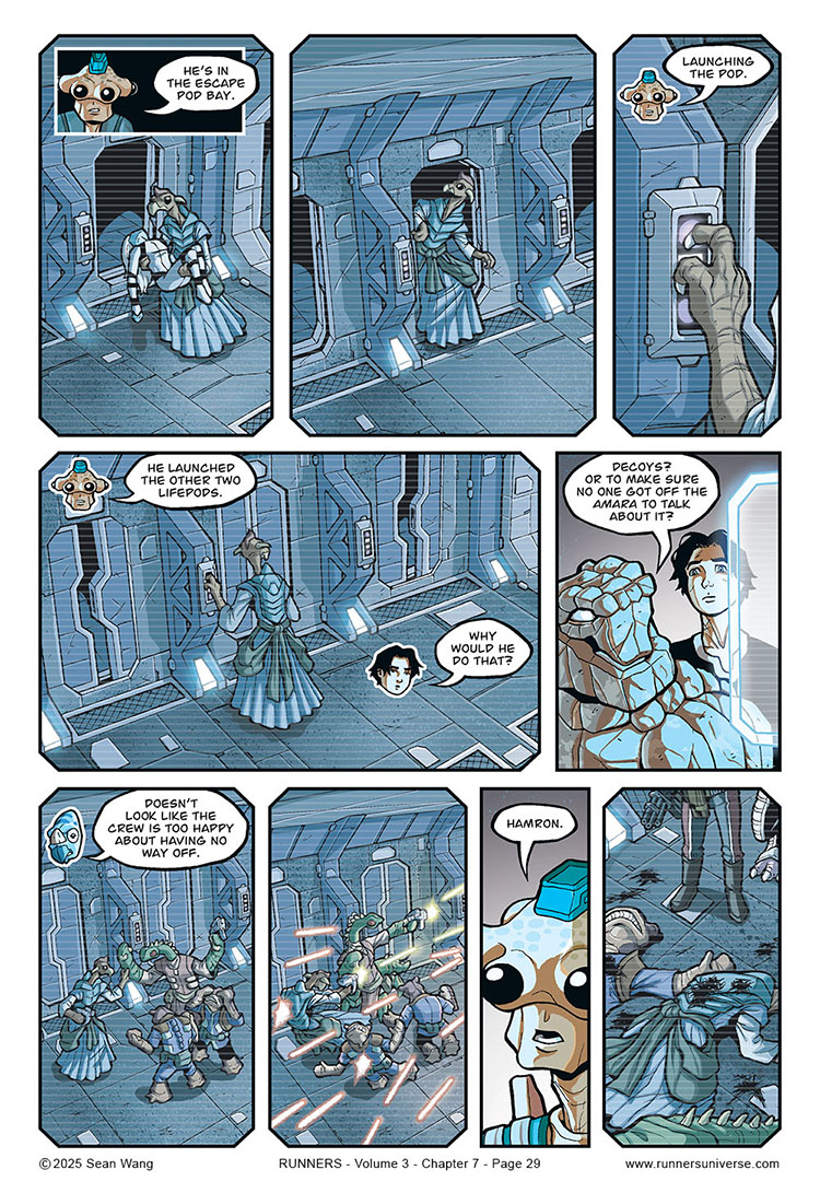
So this page was a little bit of a graphic storytelling experiment, but I like how it turned out. In this whole sequence, the crew is watching video playback while also commenting on it. Normally, I would’ve shown panels of the video, followed by actual panels of the characters commenting. But that started to feel like an unnecessary use of page real estate, cutting away from the video to just talking heads.
Normally, you can do this sort of thing with just word balloons or narration boxes over the art, but that just seems to work with a single speaker. I didn’t know how to convey DIFFERENT speakers off-screen (in this case Cember, Bocce, and Ril). So I decided to use graphics of character heads superimposed on the video panels so show which character is commenting on the action.
As a new storytelling graphic, I didn’t want it to seem confusing or too jarring and different, so I added the first panel of Cember commenting. Then, two panels later, I repeated the same basic head and position in the panel, to help transition readers into what I was doing with the head icons.
Overall, I think it works pretty well.


This works quite well. Far better than just showing the text and leaving the readers guessing who said what. Visually I think I prefer the small black panel and showing part of the body instead of floating heads.
Hmmm. Interesting. I might try the black boxes to see how they look. I think they may be a little better than the floating heads.
Agreed. It’s gets the point across without taking up too much panel space. Works better than trying to make every caption box look different for each character and making it obvious which character is talking, or pulling off an MST3K bit. I hope this catches on.