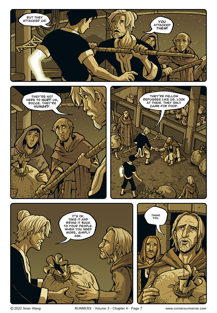
In the preceding two pages, I originally wanted the four thieves to be more obscured and much more in shadow. But the art just looked too “heavy,” especially in combination with the muddy sepia look that I was already fighting with. As it is, I think the characters are a bit too readable before the better lit reveal on this page, so their appearance isn’t the surprise that it should be.
Maybe I’ll fuss with the shadows a little more before this story goes to print in physical graphic novel form. It’d be nice to find a way to hide them in shadow more without that shadow looking unnaturally dark. But my previous attempts couldn’t quite find that sweet spot.
Regarding the 4 thieves, I originally drew them with different faces but didn’t end up liking how they turned out. They all just looked too similar and undistinguishable. For a solution, I turned to my favorite TV show, Game of Thrones, which had an expansive cast of actors who all had very different looks. I created a reference sheet of 4 characters that I thought would look appropriate for these straggly thieves: Dolorous Edd, Benjen Stark, Maester Luwin, and Pyp. I didn’t want my characters to look EXACTLY like them, but I used them as starting points for features that I would have an easier time making look different. In the end, if you know the characters, you can probably tell who was inspired by whom. But without this commentary, you’d never really know they were loosely based on anyone in particular.
Some comparison images of the original faces and the new, as well as the reference I used, can be found HERE on my Patreon, as a free Public post.


Not so much a misunderstanding, but Bocce going into Berserk mode and Pahjan showing a different way.
I stand pleasantly corrected. Also that flashback in the Snow Job begins to hit harder now that we see more of what a person Pahjan was.
I haven’t watched GoT, but I really appreciate the bonus content.