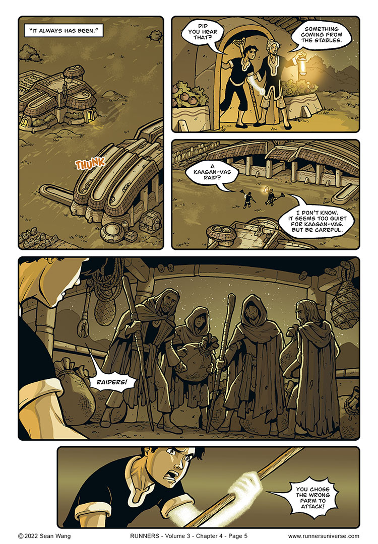
The next few pages are part of the continuing Bocce flashbacks, which I had established a sepia look for, but in this case, I’m not entirely happy with the finished look. I had Cyril, one of my two colorists, color it normally, with the caveat that I would be doing the sepia effects afterwards to match the earlier flashbacks. I thought the original pages Cyril did looked really great (with nighttime colors and moonlit highlights), but in doing my sepia steps, it just lost a bit of that nice nighttime feel.
Ultimately, I just think sepia works better for daytime scenes. Nighttime in sepia just looks a bit muddy to me, at least when I’ve been able to see the original art by comparison. I’ve already made the mental note that for future Bocce flashbacks, I’ll probably try to stick to daytime scenes.


Now I want to see the page without the sepia filter…
In another few pages, I will actually provide a link to a public (free) post on my Patreon, where you’ll get to see the original and sepia pages side-by-side.
Yes, +1 for seeing the original page.
An alternative for the sepia tone could be different borders to indicate it’s a flashback. Or would that lead you to re-work the previous pages?
To be fair, this looks fine and I look forward to the upcoming action scene. Unless there is a twist waiting…
LOTR COSPLAYERS! YOU CHOSE THE WRONG FARM TO ATTACK!
What about a semi sepia like this… https://i.pinimg.com/originals/7f/53/37/7f533760dcf21b5b54004bc540aaa2d3.jpg
I like it! I will say that in all my Bocce flashbacks, I did do a semi-sepia since I wanted to keep some slight element of color to them. In this sequence, I experimented with pulling back the sepia a bit more to let more of the original colors show through. I think that would’ve worked with a daytime scene, but the mix of (original) blue tint and sepia tint didn’t quite mix well in any combo. But I may try it again at some point before it goes to print.
I have been reading Rachel Bennett and Alex Kain’s Beyond the Western Deep and they also switch to rounded panels to indicate when the action is taking place in the past. Is this a widespread shorthand in comics for depicting flashbacks or just a weird coincidence?
I’m friends with Alex and Rachel and love Western Deep! Everyone should go check it out online and in print. Really fun and beautiful adventure story with animal characters. Love the cartoony style.
To answer your question about the rounded corners, I don’t know if it’s really a standard. I think I just found it to be a good way to differentiate real time from flashback. In the very first flashback I did in Vol 1 (where Roka remembers the job with Grissom that went wrong), I also switched from white background to black. I think that worked well too but didn’t use it for Bocce’s flashbacks since I thought the sepia effect was enough. But in both cases, I also used the rounded corners.
Random note: in one of the Bocce flashbacks in Vol 2, I forgot to use the rounded corners. I only noticed it in the past year or so and now it bugs me! Whenever I do go to reprint, that might be one tiny thing I fix.