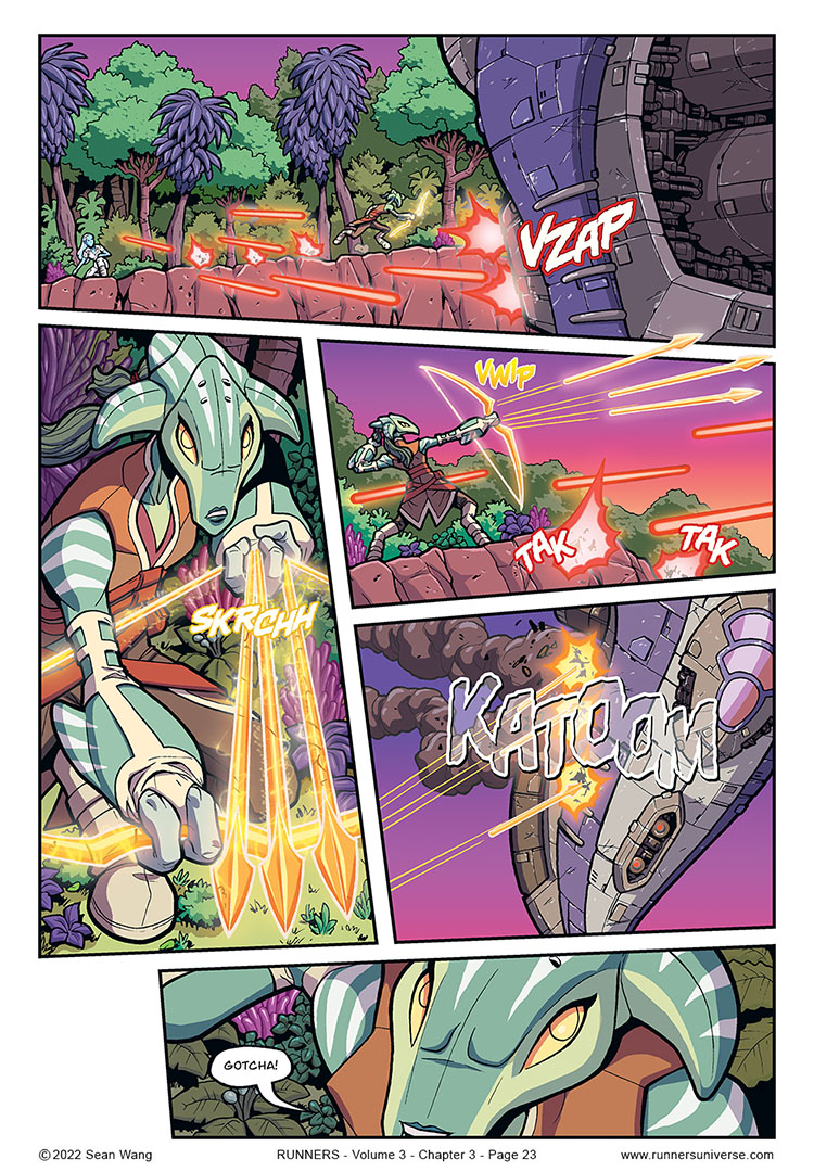
I figured this page might be a good place to point out that with Chapter 3 of this volume, I decided to embrace the use of digital fonts for sound effects. In past volumes, I did them by hand. Early ones looked a bit rough, but I think later ones started to look better. Still, with the hand drawn SFX, I was trying to get them to look as polished as professional comic SFX fonts, so I figured, why not just use those fonts?
Most of the fonts that I use are from Blambot. I downloaded a number of them that are free to use for indie comics. But I also decided to just buy some of the other ones that I thought would work well. It’s all very much a big rabbit hole of new considerations. I know some letterers say to just use a few key fonts for all SFX and avoid going overboard with too many different fonts. There’s also just the sheer number of different looks to SFX that I’m not really used to thinking too much about. But so far, it’s been fun playing around with the SFX in this chapter, although it does take a bit of time experimenting with the many options. But as I go on, I’ll be building up a library of ones that I can re-use to speed up the process in the future.


Cool! Omni-tool weapons! This is cool!
Thanks! Yeah, Jayd’s array of weapons and armor made her a fun one to write (and draw)!
Volume 3 is so full of potential spin-off titles.
I’m adding Jayd to that list.
I also purchased (for 0 dollars) a few fonts from Blambot recently. It was for a comic competition entry. It was getting too close to the deadline and I also felt some of my past hand lettering and sfx could have been better. Still, looking back these past few days I do not regret going digital.
It has long been a wish of mine to find time to do spin-off short stories that could then be collected into a volume of “Odd Jobs.” No idea when I’d even find the time though. Fortunately, a number of the new characters appearing in Vol 3 will be folded into the bigger story, so they won’t have to wait for a spin-off!
And yes, I really like digital lettering too. I’ve always had very neat handwriting and also picked up the architectural lettering style from my college days. But I quickly found that neat handwriting does not necessarily translate to good comic lettering, which is why I transitioned fairly early on to a digital font. The SFX fonts were the last hold-out but now those are finally digital as well.
Using fonts for SFX also allows a bit more variety unless you’re that good at lettering. The variety keeps them from all looking the same and can look more specific to what’s making the noise.
Agreed! And there are so many to choose from. I just have to avoid the temptation (and time suck) of playing around with too many.
These are neat looking sound effects, and the sounds are great, too! (I especially like SKRCHH and VWIP)
Thanks! I have to admit I have a HARD time coming up with the sounds for various things. I tend to use and reuse the same ones, especially for laser and hit sounds. Maybe some people are good at figuring out onomatopoeia, but I am not one of them.
I’m not an artist so some (a lot) of what good artists do seems like some kind of magic trick.
Case in point: first panel is a large “zoomed out” shot with lots of convoluted, overlapping foliage.
Also in the shot is a big, close up, high detail spaceship in contrasting colours filling the scene with laser blasts and little explosions and SFX.
Also, also in the shot is Sky, a character who appears small but nonetheless sports bright colours that stand out against the trees.
And yet, somehow (and I’ve tried this several times) my eyes first focus on Jayd; a character who is mostly brown and green depicted very small against a mostly brown and green background. Sorcery!?
Think this is because Jayd is subtly the darkest forefront shape, with the lighter orange laser bolts either side and the yellow light bow in her hand. Human eyes are drawn to the darkest parts of a screen or page when most of it is lighter, with unique shapes drawing eyes more (which is why the shadow of trees not so interesting as multiple and and around more similar coloured trees.
Honestly, I wish I could say I KNEW what I was doing and have a master plan on how to move a reader’s eye to where I want it to be. But I’d be lying. I think a lot of it comes down to what FEELS right to me, so to hear that it’s effective is awesome! I think it the case of the top panel, it’s definitely helped by Jayd being right in the center of the panel, with the gap in laser bolts drawing your eye there as they frame her. Again, I’d like to say that gap was 100% intentional, but I prob just didn’t want a laser bolt covering her!