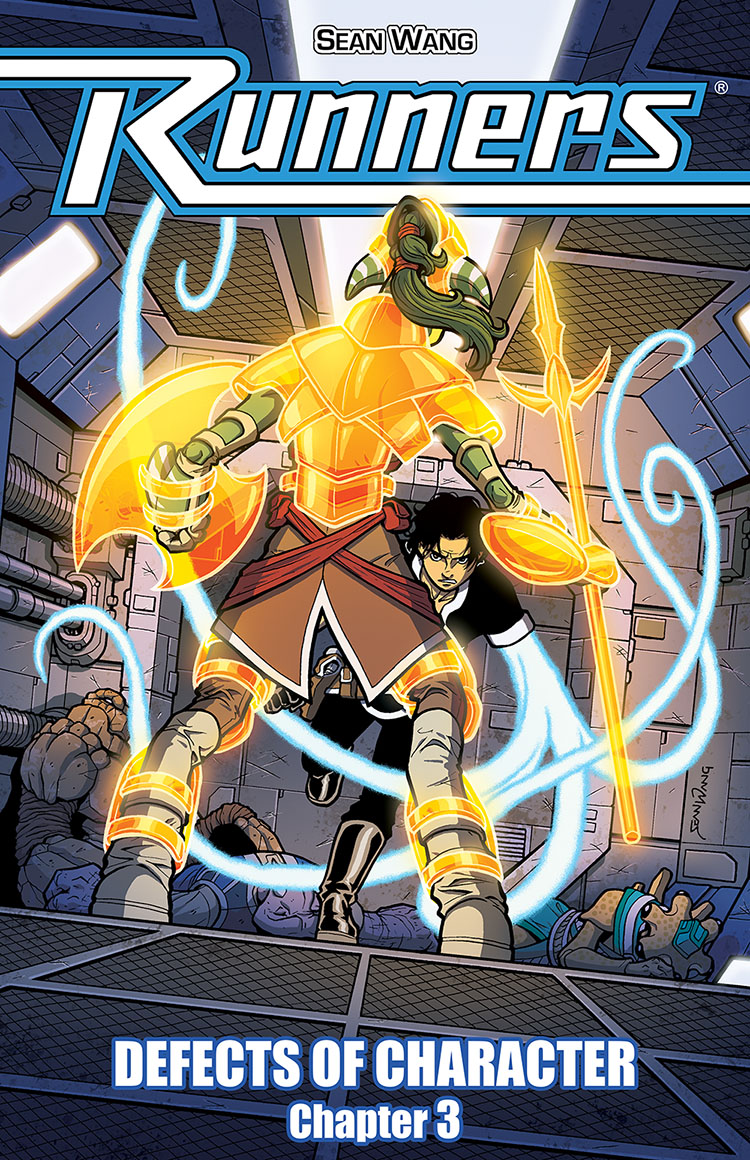
This was a fun one to do. I wanted the cover to be a dramatic fight scene that focused less on the actual fight and more on the orange glowing armor and Bocce’s blue energy arm. I was particularly happy with the way Bocce’s face is framed behind Jayd and how the blue overlay helps to push everything back but the two main characters.
I did a short post on the creation of the page HERE. And for Patreon backers, you can get a much more detailed breakdown of the process HERE.


This is the kind of cover that sells books or at least makes people take notice.
Let’s go!
Good to hear! Thanks!!
Definitely dynamic! Also intriguing, as we note that 3 of our heroes have already been rendered unconscious. :O
This may or may not be a case of false advertising! Ha ha. I do occasionally like to do a cover that captures the SPIRIT of the scene even if it’s not entirely true to the exact details. For instance, this cover from Vol 1, which never really happened in the story: https://runnersuniverse.com/comic/bad-goods-ch-04-cover/
So maybe they’re all unconscious in the story, maybe they’re all hanging back sipping boba teas while they let Bocce take point. We shall see!
Rad!
Thanks!!