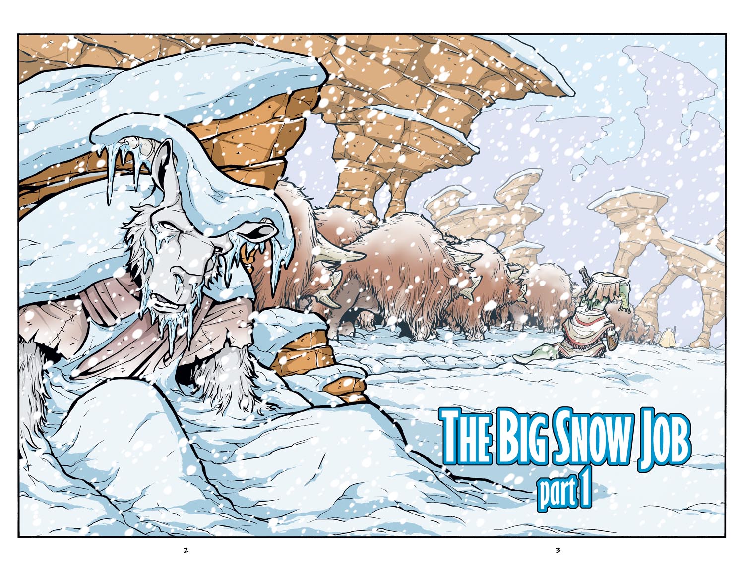
So I wanted the first sequence to be silent and somewhat creepy. And for me, nothing says “creepy” like a guy frozen to death out in the elements. It probably goes back to me seeing The Shining at way too young an age. Along those lines, elevators full of blood and party-goers in animal costumes….also creepy. But chances are I won’t be squeezing those into any RUNNERS stories anytime soon.
BTW, as a double spread, this image gets resized and shrunk a bit here. To view it full size in Firefox, you can right click and select View Image, which will open up the full-size image in another tab. In IE, you can use the Zoom buttons on the lower right. Unlike the previous 2-page spread from Bad Goods, at least there’s no dialogue to read here!


It’s actually the perfect size to be my new desktop image…
That definitely resembles Jack Nicholson (minus the smile) in the
horrific scene from The Shining, great job for a first title page.
This looks great!! Do you ink this digitally? Or by hand and scan it in later?
Hi Gabriel. I pencil and ink on bristol board and then scan the artwork in to color and letter the pages digitally. So all the linework is done the old-fashioned way, by hand!