BONUS CONTENT: Art Process “Snow Job” #1 cover, Pt 3
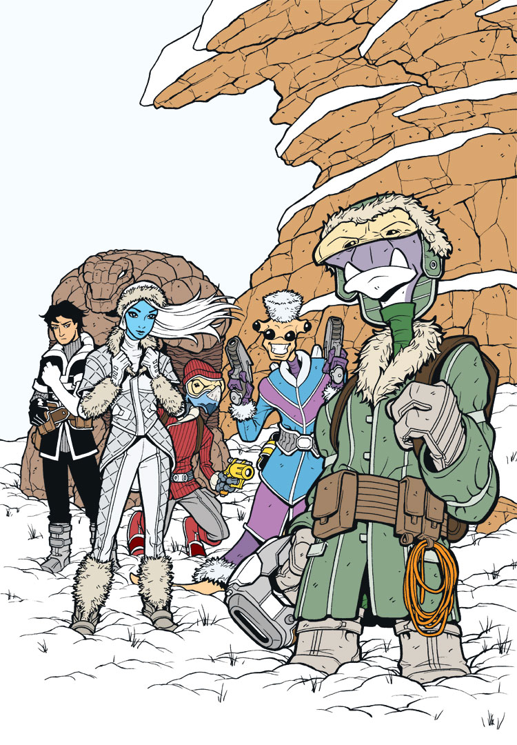
Here we have the color flat stage. At this point, I’m just dropping in all the base colors and defining those areas. Just so I don’t kill myself with a ton of different colors on each character, I try to stick to something like 3 main colors per character. For instance, with Roka, I could have made his gloves a different color from his boots and his hat a different color from his jacket, but that would get to be a real pain over time to keep doing on every panel and every page. So for simplicity’s sake, I just use a few main colors on each character and just move them around on that character’s various elements. As another example, with Cember, he has light blue, light purple, and dark purple (with the same dark purple distributed around his body on the neck, gloves, and lower skirt panel). Characters then have some additional embellishing colors as well, but at least the main colors are simplified that way.
A little coloring tip: there are a lot of areas that look white on this page, but when I drop them in at this stage, I drop in a very slightly different white for grouped features. For instance, the sky is one white, the snow on the rocks is another white, the ground snow is another, the white on Sky’s outfit is another, and all the other white bits on the various characters is another. The differences can be as little as 1 value difference in any of the C, M, Y, or K values. The importance is just that it’s different enough that a Magic Wand tool in Photoshop (set to a Tolerance of 1) will pick up one but not the other. That way, if I want to select all the ground snow, I just use the Magic Wand on it, and it will only select that particular white (the ground snow) and not any of the others.
Sometimes I’ll do something similar with other features, like the rock wall. In the Color Flats stage, I might make all the lower rock one shade of brown and the upper rock just a very slightly different shade. The eye may not pick it up, but the Wand will, which makes selection much easier for the next stage.
Next up, color shading…


Wow.. that’s awesome using the wand’s narrow margin in selection like that so easily… I wish I had thought of that. It would have helped me so many times in the past.
Thanks for the lifesaver tip, Sean!
No problem! Glad to be of help.
Heh! I noticed that but put it down to the artist eye for detail.
White is never white anyway, so the eye picks up and uses such small cues to place surfaces.
For example, snow cover vs “white out” snowing sky to place the horizon. (Not always possible in that particular example of course, most of the times you get a simile “visibility horizon”. But you get the picture.)
In any case, this works well for everyone.
Oh, and a terrific work it is!