Just a reminder that this weekend (July 9-11), I will be set up in the Artist Colony section of ConnectiCon (a predominantly anime, manga, and webcomic show) at the CT Convention Center in Hartford. Hope to see you there!
Ahh, the last remnants of my MIT architectural schooling. Money well spent!
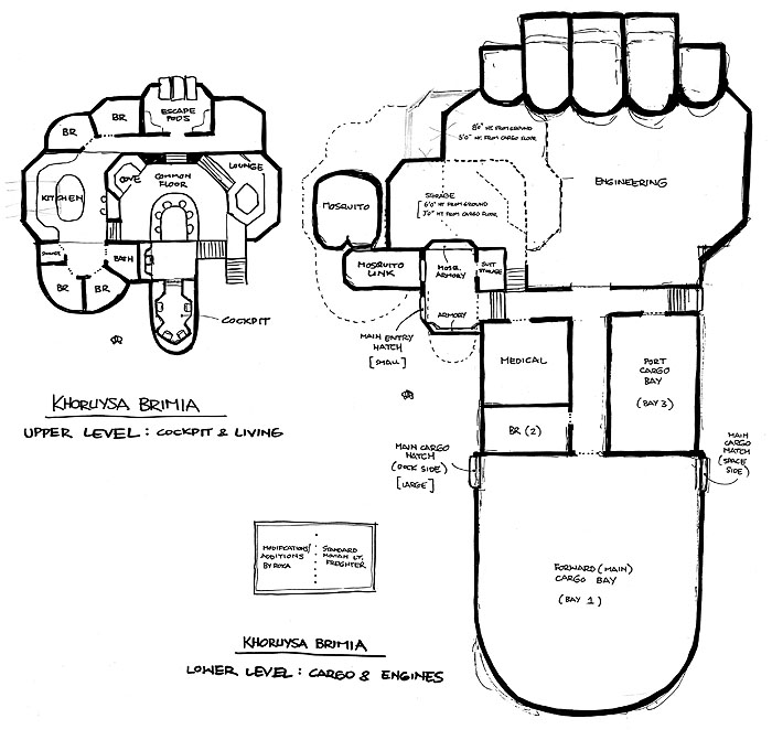
These are the floor plans I drew up many, many years ago, before I started the artwork on the first RUNNERS story arc. I needed to figure out the layout of the ship so that things would make sense once I got to drawing the interiors.
A few things to note: right behind the cockpit, the plans show a small nook with a console station. At the time I thought it would be a nice halfway station between the common area and the cockpit, but in reality, the distance isn’t that great that it would need a halfway point. I’ve since changed it to a small cot, which makes a bit more sense. Anyone on flight duty can take a nap there if necessary, but still be just a few steps away from the cockpit if any emergencies arise.
On the cargo level, I figured the freighter originally had three cargo bays: a big one towards the front, with two smaller ones behind it. Roka at some point converted one of them to a medical bay and additional bedroom. Unlike the bedrooms up top, this larger one is meant to accommodate two people, so that would be Cember and Bennesaud.
All of the Mosquito-related bits are modifications added by Roka, which includes the spacesuit storage, armory, Mosquito link, and the Mosquito itself. The standard version of the Movian freighter obviously doesn’t need the extra shuttle/fighter, so those parts were specifically added to the Brimia due to the hazardous nature of their work.
Bear in mind that this is a pretty old schematic, so I may be changing some things. For one, maybe each bedroom will have its own small bathroom. The single communal bathroom seems a bit odd for a ship housing so many people. But then I guess it could make for some nice scenes of Sky walking back to her room in a towel after a shower. 🙂
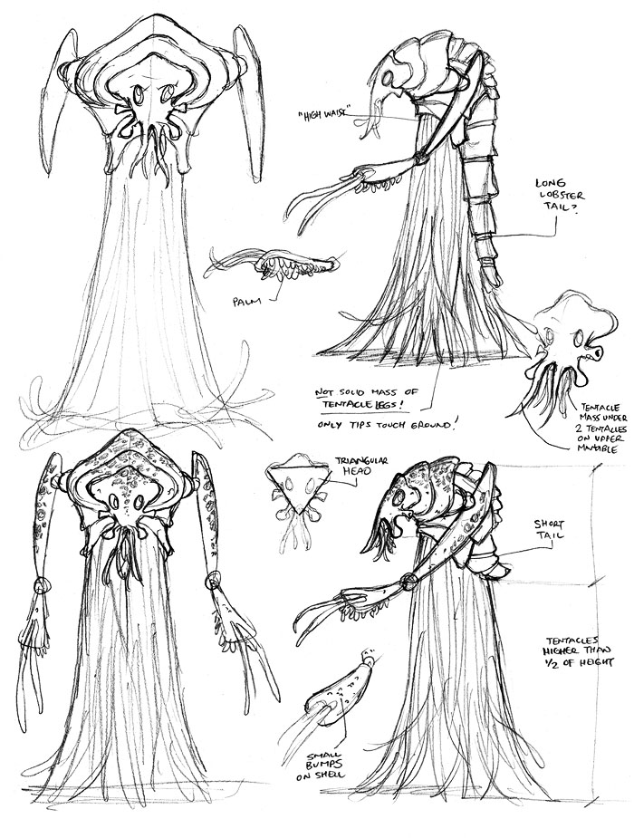
The design for Dhama Hes (The Big Snow Job #1, Page 18) was a lot of fun as I wanted him to be very alien and creepy. So I played with some odd proportions (like the very high waist such that he practically has no torso) and weird textures (like the knobby hand palms and mass of thin tentacles for the lower body). And there was something about the spinal ridge on his back shell that was kinda unnerving to me, since it had the appearance of exposed vertebrae.
Looking at the sketches again now, I apparently meant to do some sort of spotted pattern on portions of the upper body shell and arms. Whoops. That’s the problem with leaving some things out at the pencil and ink stage. There’s a good chance I might forget to do those details when I actually get to the coloring stage many months later. Oh well.
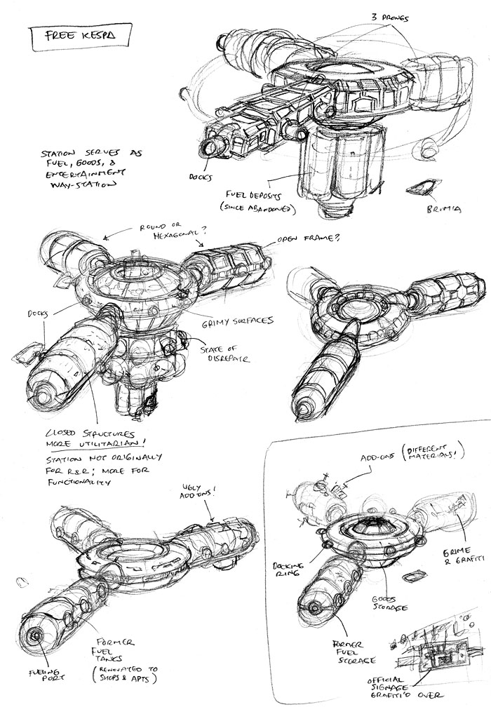
Here we have some sketches I did for Free Kespa, the run-down space station that Roka and company go to in The Big Snow Job #1, Page 15 to meet with Dhama Hes about a job. I knew I wanted the station to have three prongs to it, radiating from a central hub, so the design went fairly quickly.
I thought it might make sense to have the central hub be the main docking area for ships just looking for light supplies or a bit of R&R. I imagined the prongs to be the equivalent of granaries or depots, where major restocking supplies would be kept for larger ships in need of more goods. I’m guessing at this point, those depots have been long since emptied and converted into ramshackle slums and shady businesses.
There’s probably a Starbucks there too.
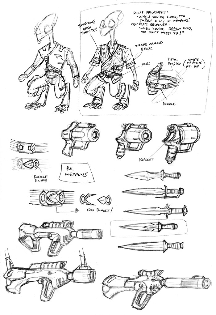
I designed Ril’s port outfit to have some slight stylistic similarities to his Bad Goods outfit. In this case, I like that the top has a crossover flap that wraps all the way around the back and clasps onto the front again on the opposite side. It just seemed like a cool look that was a bit different from the norm. Probably not the most practical thing in the world, but then fashion rarely is, I guess.
With Ril’s gun, I like that it’s a bit odd in proportion, with its oversized, thick stubby barrel. I’m not a huge fan of trying to make every weapon look “badass,” so I intentionally try to keep some weapons non-flashy. I was pretty happy with all three rifle sketches, but I ultimately settled on the bottom left one, again because it had the most unusual proportions of the three.
I haven’t decided yet if the pistol on this page is Ril’s signature gun or if it’s just one of many different handguns he’ll carry on different jobs. I imagine him to be a bit of a gun collector, so it would make sense for him to use a wide variety of weapons over the course of the series. I guess we’ll just see how lazy I am during the design phase of the upcoming arcs…
Additional commentary about the outfits can be found in the posting for The Big Snow Job #1, Page 14.
