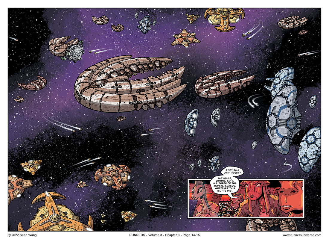
Just as the scene with Roka and the pilots in Chapter 1 was a way for me to finally start introducing the Unified military, this scene is its counterpart in introducing readers to the Tet’Sali.
The ship design for this scene was very difficult. Basically, as an alliance, I wanted all three races to have similar attributes, so that readers would be able to quickly connect them as all being on the same side and being visually different from Unified ships. On top of that, I also wanted each ship to convey its respective race visually, sharing distinctive physical features and/or colors so readers could easily associate which ships belonged to which race. Finally, I wanted all the ships of one race to have a similar aesthetic, so that small fighters, medium transports, and large capital ships of one race would all immediately look like they belonged together.
It took a long time to settle on the names of the three Tet’Sali races, since I needed them to all work together and not just be completely their own thing. I deliberately worked to find names that had similar vowel and consonant sounds as “Tet’Sali,” so that when you heard the names “Tas’Qelar,” Cetii,” and “Liotian,” it would be easier to associate them with “Tet’Sali” due to similar sounds. But at the same time, I didn’t want the three to sound too similar to each other. So they each needed to be distinct from one another, but they all, in some way, had to sound like “Tet’Sali.”
Regarding the name “Tas’Qelar,” it has since come to my attention that there is a board game called Tash-Kalar. Argh. I actually was not aware of that at all when I came up with my name. To be honest, Tas’Qelar actually came from the Dosh Kaleen in Game of Thrones (the group of widows in the Dothraki). I just really loved those sounds together and wanted to come up with something that had a similar vibe.


They kinda look like aquatic critters. Orange starfish, tan trilobites, blue mussels.
Interesting. Had not noticed that. I like it as a unifying theme!
Was Fishy Longneck not wearing her prescription goggles? How did she not see the giant swarm of ships?
Ha ha. Yeah, I was wondering if someone would call that out. I figured maybe the image above is a close up of something they would actually be seeing from more of a distance. But ultimately, I decided it would be something I conveniently ignore for dramatic purposes!
The different sizes of ships with consistent aesthetics remind me of the board game Eclipse. Looking good.
I am an avid board gamer myself but have not had the chance to play Eclipse yet. I have heard of it though, so it’s on my radar to check out at some point.
Oh yeah, I forgot to mention in the commentary that you can right-click on the image to Open in New Tab to get a slightly larger version, if the text is a little hard to read.
Thanks for the tip. Two thumbs up for all the thought that went into the designs and naming. Can’t wait to see this spread in print.
awesome!!!