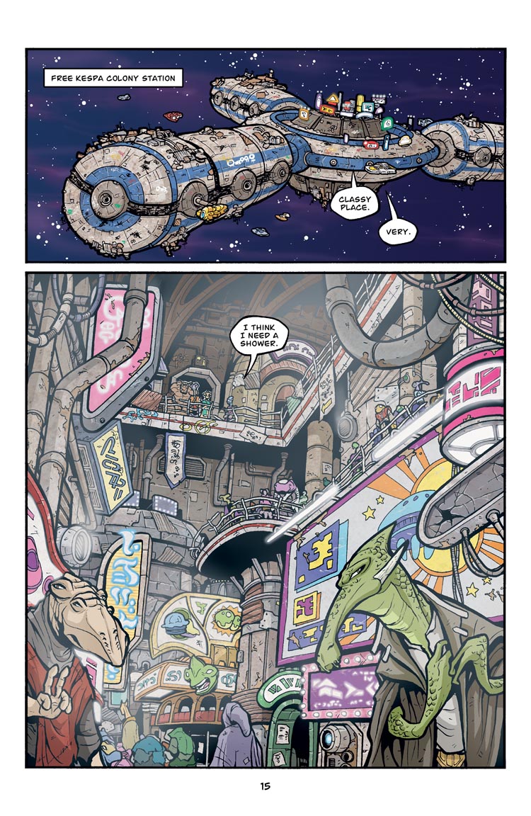
The RUNNERS universe is not a pretty one. Well, it can be in places, but there are also plenty of seedy areas to go around. Given the crew is down on their luck in this story, I wanted them to really be slumming it by going to this run-down ghetto of a station looking for work. I wanted it to look like a station that used to be nice but eventually deteriorated into an eyesore, with random additions and patches, obnoxious signs, and graffiti covering both the exterior and interior.
The two aliens in the foreground are conducting a drug transaction, by the way. You can tell by the sly way they’re looking around them, even though they’re standing in the middle of the street. 🙂


Oooh, I love this page. And the story’s picking up–yay!
That is a great visual.
Beautiful page! I love the weird alien advertisements and the atmospheric haze!
Could you put the update schedule somewhere on the top of the page? (New comics every Tuesday and Thursday!) I check it regularly, but always forget what days the comic updates… Maybe under the “Sean Wang Presents Sean Wang’s Runners by Sean Wang” graphic.
Actually, he has an RSS feed now. Otherwise I’d be in the same boat as you, bryant.
I love the graffiti in places where it’s ludicrously dangerous to have done it; absurd, but completely realistic.
Are those houses on the outside of the space station? They’re like barnacles on a whale. Nice touch!
They’re advertising…
That was exactly the look I was going for! Yes, those are shanty-like houses attached to the outside of the station, although I’m sure they have holes cut into the hull to access the station itself. I wanted it to look very slum-ish with unsightly shanties popping up all over it.
Cool effect with using the white to give it that smoky atmosphere.
Yeah, I found that when I added the haze, that’s what REALLY made it feel like a believable environment to me. Before that, I still liked it but it felt a bit too “crisp” to me. It’s the little things. Later on in the series, once they get to the snow planet, I had a similar situation where the characters just looked out of place and “crisp” in the scenery. But when I added just a slight dusting of snow to their shoulders and feet, that tied them to the environment and made it work and seem more believable.
I love the visual, though I have to wonder how one manages to get graffiti on the outside of a space station (if that’s what it is, I’m not sure…)
This looks great! I have a random question: How did you add the atmospheric effects in the last panel? Did you just make a separate layer over some of the background and color it slightly whiter?
Yep! I basically had an extra layer on top and did a white haze on it. I could then play with the opacity to get the density that I wanted. I also erased a little around the foreground elements (pipes and sign at top) so they’d be less hazy, being closer and all. If I were to do it now, I would probably do 2-3 layers of haze, from foreground to background, so that I could control each independently. But at that time, I guess one layer (with some parts slightly erased) was fine.