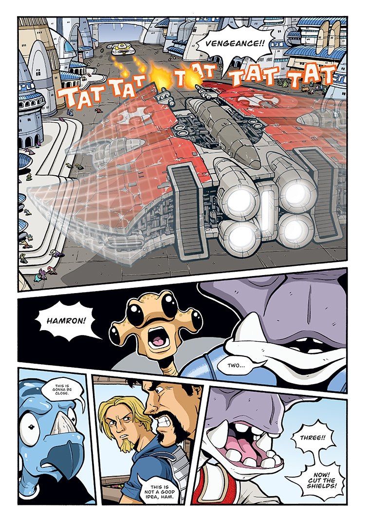
At the time, the top panel of the Hatchet de-cloaking was pretty ambitious for me, FX-wise. I was pretty well versed with Photoshop, but doing a ship that went from solid to transparent while also having gridlines that faded in and out was probably the biggest FX shot of the series and took quite a lot of effort to get right.
These days, it would be a snap, especially since Photoshop now has layer masks that I don’t think were available back then.


I’m loving this comic, and the first panel is awesome, but the best panel on this page has got to be Ril.
I can _see_ what he’s thinking: “Oh crap!”
Excellent Job!!!!
Thanks, Joe! Glad you like the Ril panel. It’s amazing what you can accomplish with just some tiny eye pupils!
that first panel is magnificent. I like how one can also get a view of the ground faded underneath the hull itself.
Thanks, Cyko. I didn’t do any of the FX on the inked page, so if you ever see the original art, it’s just drawn as a solid ship. So when I got to the Photoshop stage, I had a lot of work to do! I ended up drawing in the street and buildings underneath and behind the ship as well as all the cloaking effect gridlines at that point. If the background had been more complex, I might have considered drawing the ship on an overlay to keep it as a separate layer entirely.
Along those lines, I just got David Petersen’s MOUSEGUARD Black & White edition, which is a full-size (original art size) hardcover collection of the entire first story as B&W art. He even includes all the rain page overlays as vellum sheets bound into the book, and it is amazing to look at. Anyway, I’d probably do overlays like that in the future for complicated cloaking scenes.
BTW, if you can find it, get that MOUSEGUARD book. It’s a work of art.
What’s so great about all this commentary is learning how the process works so one could, if ambitious enough, try to duplicate similar effects. I doubt I would have guessed how difficult panel one was to compose without the commentary.