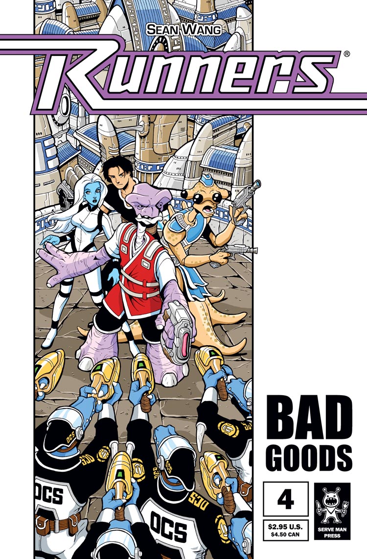
I think the most eye-catching and effective comic book covers are usually the simplest, usually with just some simple graphic element to them. This was NOT one of those covers. I think it may be a bit busy, what with all the background buildings, but I like the “what’s gonna happen next?” moment being portrayed. In retrospect, I probably should have done a slight color hold on the buildings (replacing the black lines with a slightly lighter color) to help push them back a bit visually.
For the record, the “OCS” on the police uniforms stands for “Oniaka City Sentry.” There’s always that internal debate about whether that sort of thing should be in real legible letters (representing the universal Base language) or in indecipherable squiggles (representing the native alien language). In this case, I figured the city-station is open to all sorts of visiting races, so the letters would be in Base.


Sean– I’m enjoying this story! (Found you through Republibot.)
Why did you choose to use only 2/3 of the cover?
It was just an aesthetic decision I made for the first story arc to have all the issue covers have a graphic bar on the right side where the story title, issue number, and price info would be. I thought it would stand out a bit more on the store shelves compared to all the other comic covers that way. Not sure if it succeeded though! At the time (and still today), I found a lot of the more eye-catching comic covers to have some sort of graphic quality to them instead of just a full image.
I’ll admit that I find covers to be one of the hardest things to do in terms of doing a single image that captures all of the following: sums up the events of that issue, forms a striking image that can be read very quickly and isn’t overly-complicated, and sets up some sort of suspense to make people want to find out what happens inside.
Or I could just go the big-company route and make every cover a non-story-specific glam shot that can be re-used for various merchandise. That would probably make more sense if I actually had RUNNERS merchandise. 🙂
I just went back and looked at the previous covers. (I’m guessing the Ch. 1 cover was redone for free comic book day?) It’s funny that I hadn’t remembered that you’d done them this way before. The white background against the white screen just struck me, I guess.