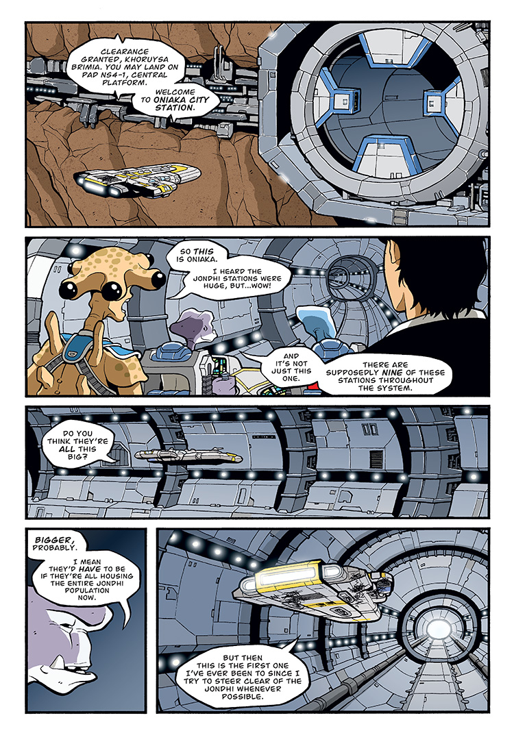
As a huge city station that houses a large population, I imagined not everyone would live on the surface. I figured some of the residents, the less wealthy class, would have homes built below the surface in the planetoid rock. The better apartments among this class would ring the outermost part of the underground so they’d at least get a view of space. I imagined that’s what some of the structures and lights are in the equator around the entry hatches. It made some sense to me that the more industrial apartments would be near the transportation lines, like less-desirable real-world homes being in close proximity to railroad tracks, airport runways, or busy highways.
Again, for story reasons, I wanted the insides of the entry tunnels to be recognizable for when the crew winds up there again later. So I gave it a more memorable look, with the long horizontal bands of running lights. I also like how the prominent horizontal bands really accentuate the long tunnel feel.


That makes sense in an environment with an atmosphere, but on a space station wouldn’t the residents closest to the surface would be getting less gravity and more radiation? they would become much weaker overtime…
On the contrary, if comic books have taught me anything, it’s that exposure to radiation actually makes you stronger! 🙂
You put lots of effort in the pages with the right amount of detail, and rich backgrounds. And the characters are beautifully rendered and devised. Very good work!
Thanks Julio! Sometimes I wish I didn’t have to do all the detail so that I can crank out the pages faster. But then I think it’s the detail that sells the series as a (hopefully) believable universe.
I agree with Julio, your work reminds me of Xenozoic Tales by Mark Schultz. Each page is well thought out and executed with the highest level of quality possible. The only downside… long periods of waiting between story arcs.
Ugh. Yes, I agree on the downside. As frustrating as it may be for a reader waiting for the stories, imagine how frustrating it may be for me since I KNOW what’s coming and I’m really psyched to get the big epic ball rolling. I took a break between the first arc and the new one (roughly 2005-2007) to do MELTDOWN for Image and THE TICK COMIC-CON SPECIAL for New England Comics. In each case, I was hoping to increase my exposure to swing more people back to RUNNERS.
Unfortunately, both were fun projects and creatively satisfying, but didn’t really make large enough blips on the industry radar to warrant having put RUNNERS off for that amount of time. Hopefully this RunnersUniverse webcomic can help in the exposure part (please feel free to help me spread the word anywhere and everywhere!!), and I really plan to get future stories coming out much more regularly.
Funny you should say that. Meltdown is exactly what got me to look into what you had done. Then I bought Bad Goods in b&w and I’ve been a fan since. It’s been fun going back and reading it one page at a time in preparation for volume 3.
Awesome! Glad to know Meltdown brought you onboard with RUNNERS! And yeah, as much as I love reading the books as graphic novels, it’s been super fun going back and looking at these pages, especially re-reading all the comments. I’ve really missed that dialogue. Hopefully readers will continue to comment here once Vol 3 starts up!