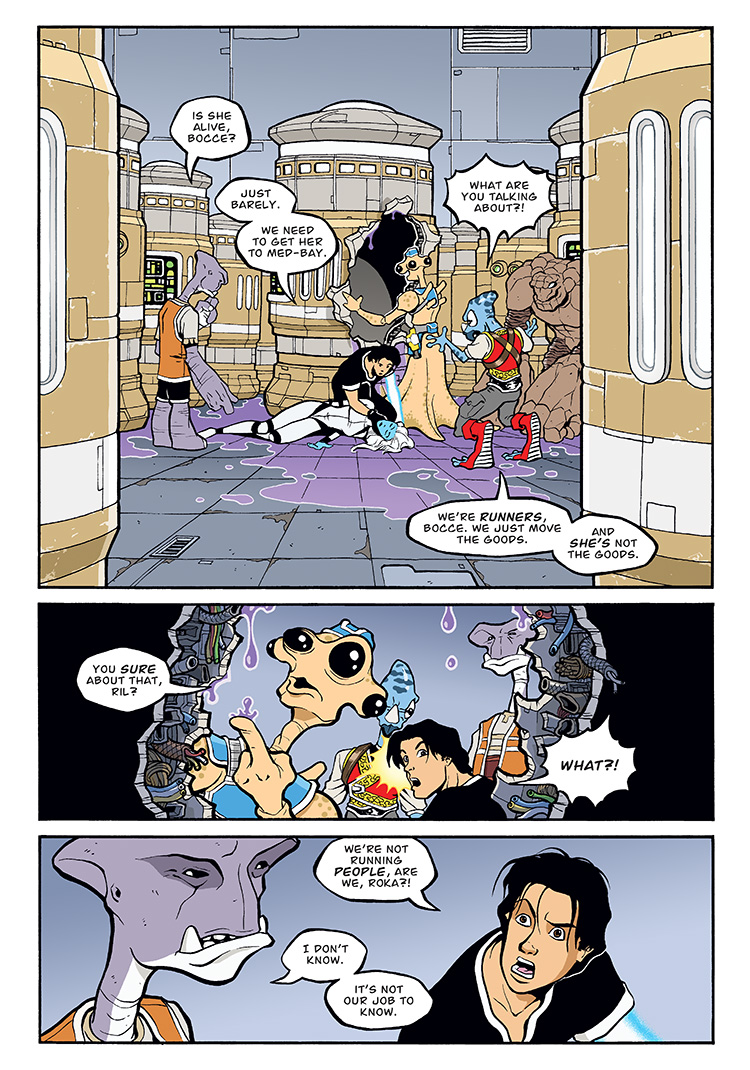
With issue #2, I setttled into an art style that I was happy with. Most readers won’t be aware of any differences since I tweaked all of the art in issue #1 to match for the release of the graphic novel (and those are also the pages that appear here as the webcomic). But the art in the original single-issue version of Runners: Bad Goods #1 was a bit different. It wasn’t hugely different, but with issue #2, I simplified some of the line work and used a greater variety of line weights (especially bolder, thicker outlines on characters) to achieve the look I was going for.
For the graphic novel, I did have to go back and tweak all of issue #2 for another reason though. While I was perfectly happy with the art, I had hand-lettered the first two issues, which didn’t turn out all that great. With issue #3, I started using a digital font, so I eventually went back and replaced all the hand lettered balloons with the same font.


Discussion ¬