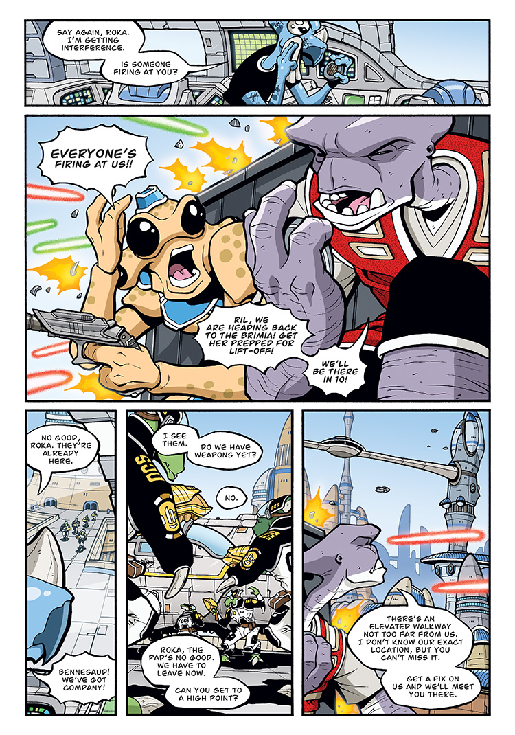
Another thing I agonize over is how to handle exclamation/shouting word balloons. Font-wise, I feel like all the words should be bold, since it’s all being shouted, but then it gets tricky trying to emphasize certain words within the shouting since the bold is already being used. I often see shouting balloons that just use the regular un-bolded font, which is what I do sometimes as well, but that feels kinda weird.
I’m probably just over-thinking it, as I’m sure most people don’t even notice.


I often find things like that distracting, but what you did in this page worked for me: I didn’t even notice the different balloons or bold text specifically; I just read the page as if they were shouting those sentences without thinking about it. So… nice job.
Cool. Glad to know it worked! I guess on this page, there’s shouting (with Ril yelling to Bennesaud that they’re got company) and then there’s SHOUTING (with Roka and Cember being under fire). So I guess the different use of the shouting balloons and bold text worked. Yay!
Another technique for indicating different tones (which you appear to have utilized), is to italicize for emphasis. I haven’t done it in a comic medium before, but for plain prose it’s relatively effective so long as the context informs the change in style.
We’d notice if it didn’t work…
I think as much as the balloons and font, it’s the tight focus of that panel and the larger lettering that really sold it to me.
Reminds me of this little exchange in Mass Effect:
https://youtu.be/lsd46Kqg2cA?t=12m18s