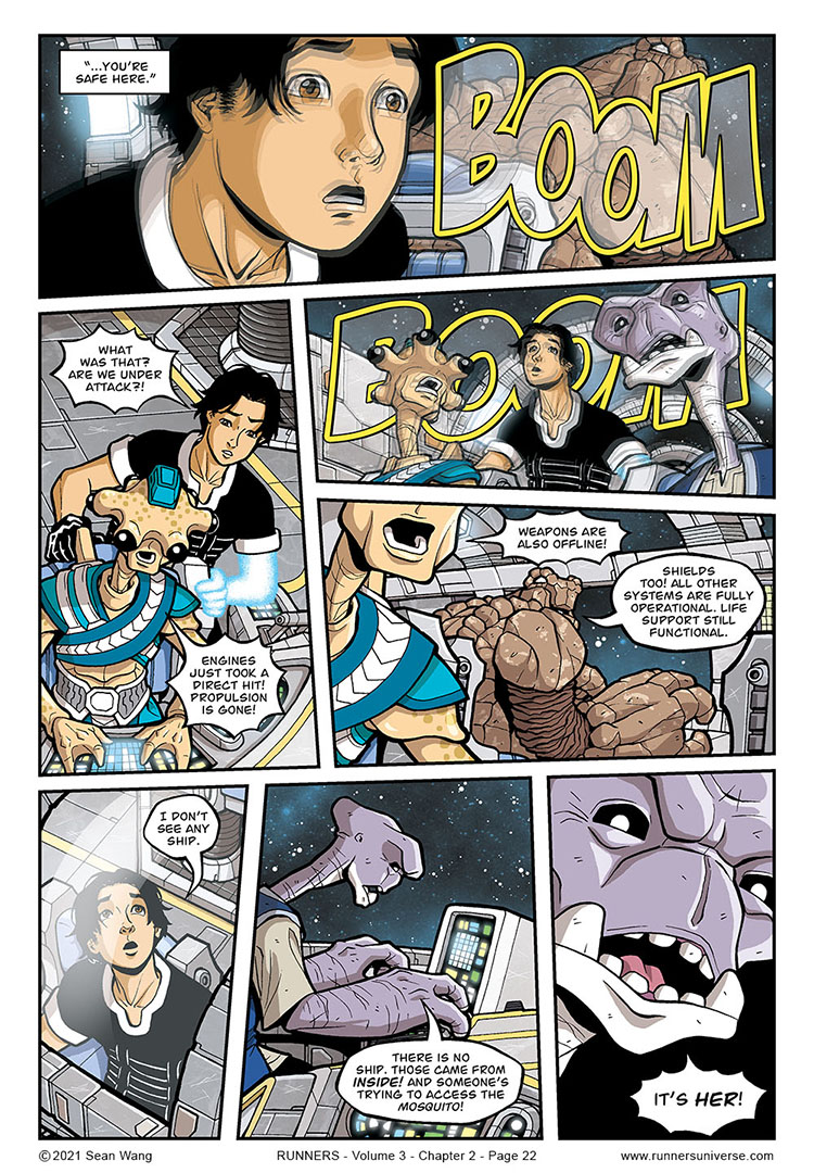
It’s probably apparent by now, but I’m a sucker for fun scene transitions. I really love making the last sentence of one scene apply in some way to the initial situation of the next scene. Here, I like Pahjan in the flashback telling Bocce he is safe, while the next scene opens with an attack.
I’ve always had issues conveying intense shaking in a visual way. The convention is drawing shaky lines, but sometimes that can look a bit cartoony. I did it in Volume 1, when the bounty hunter ships attacked the Brimia, but I was never really happy with that look. On this page, I wanted to experiment with a blur effect and offset duplicated artwork to convey the shaking. Part of me worries that it will look like a printing error in the physical book, but part of me really likes it as an alternative to shaky lines.


With the dialog and sound effect not being blurred I figured out that it wasn’t an art error after a second or two when I actually started reading instead of just looking at it, but that’s the problem with new techniques. You have to get the reader used to it but if done right it does benefit the story. I think it’s a better solution than just the lines and maybe it’ll catch on.
It looks nicer than the conventional way, so perhaps you can make it one of your trademarks.
I do wonder if it will look as good in print, so that should definitely be checked.
I feel like I have seen the “double exposure” look used elsewhere to convey shaking. But yeah, for now I do like it more than the cartoony old-school shaky lines. I’ll definitely be curious to how how it looks in print. On the plus side, if I ever do have bad print jobs that come out blurry, I’ll just say it’s intentional and the ship is shaking in those scenes. 🙂