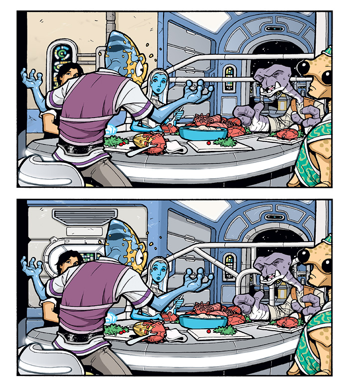
BONUS CONTENT: Art Tweak: Brimia Interior, Pt 3
And here we have the last examples of the art revisions I made to the Brimia scene from The Big Snow Job #1, Page 10. This shows the new railing I mentioned in the last post and how it’s a bit more interesting shape-wise than the original horizontal bar.
The corridor to the cockpit is pretty much the same, but the wall on the left always felt really weird and flat. The new version is still pretty flat, but the grooves at least break up the surface in a more interesting way, and the continuation of the blue trim makes it feel much more cohesive.
Overall, I really like the blue and gray palette of the interior in the new version. I originally went with the tan color to make the common area feel warmer and homier, but it just didn’t register as very sci-fi to me. Changing it to gray makes it seem more like what it is: metal. But there’s also a good amount of the blue to add some color and still keep the room feeling homey.


Discussion ¬