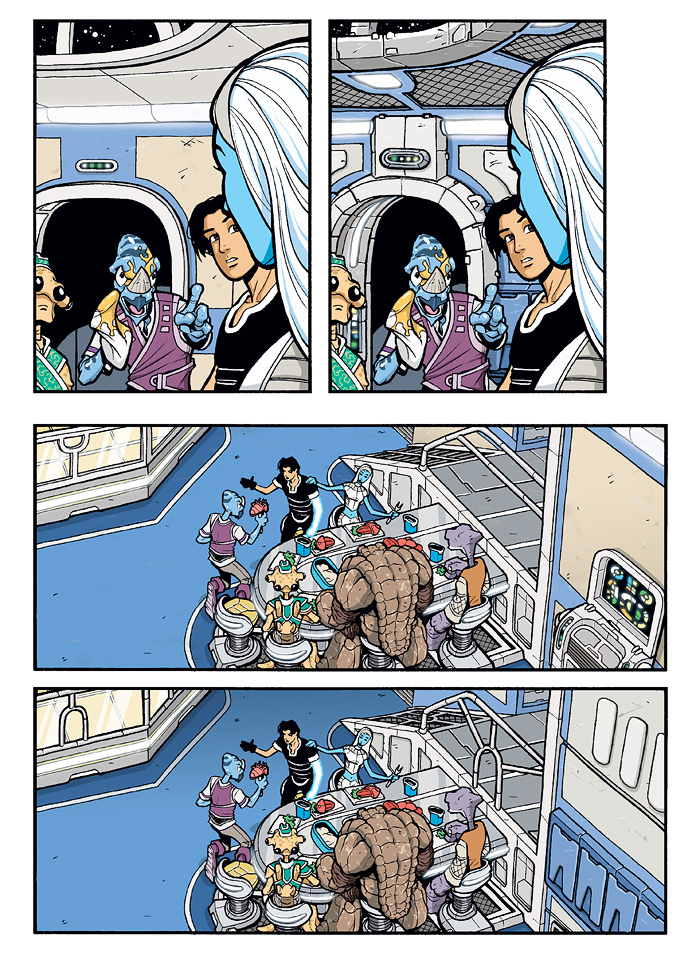
BONUS CONTENT: Art Tweak: Brimia Interior, Pt 2
More examples of the art revisions I made to the Brimia scene from The Big Snow Job #1, Page 10. Like the trim everywhere else, the original skylight (or would that be “starlight?”) trim was way too thin, especially for a part of the ship that transitions from interior to outer space. As it is, it’s still a bit thin and I’ll most likely thicken it when it next shows up, but it’s definitely better. I think the grate ceiling adds a slightly industrial look, which I like infinitely better than the weird drop-ceiling of the old version.
With the lower panel, I didn’t change too much. It’s mostly the railing, which was just a tad boring. I thought the central arch shape and radiating bars would be more interesting since they would break up the background in certain angles more than that single horizontal bar would. Eagle-eyed readers may notice that I also changed the grate pattern on the ramp to have the same arch shape.
I also changed the random wall console into more of the blue storage locker shapes that run all around the room. Easier to draw!


But with that change to the railing, they can’t run from the cockpit, grab the lower bar, swing under it, and do a dukes of hazzard-esque power slide across the dining table for humorous effect!
As I’ve already commented on the design (ha, me & design…), I’ll get to the technical.
Gratings makes sense in spaceships/-stations, as regulated and filtered air flow would mean less cleaning.
I’m with Exxos on the railing, plus it looks like expensive custom design and not something you would expect on the Brimia. Yes, it is customed we have been told, but for function and with scarce cash, supposedly. The “boring” railing looks spiffy to me and the new one boring… potato, potatoe. [/not that I would ordinarily go into such details]