BONUS CONTENT: Art Tweak: Brimia Interior, Pt 1
The next few Bonus Feature posts will be a little different and focus on some art revisions I made to the Brimia scene that started on The Big Snow Job #1, Page 10. As I mentioned on that page’s commentary, for this story arc, I tweaked the details of the interior a bit to simplify things but then found the new design to be a bit too simple. So I went back and re-designed the interior again to get back to a more interesting sci-fi look.
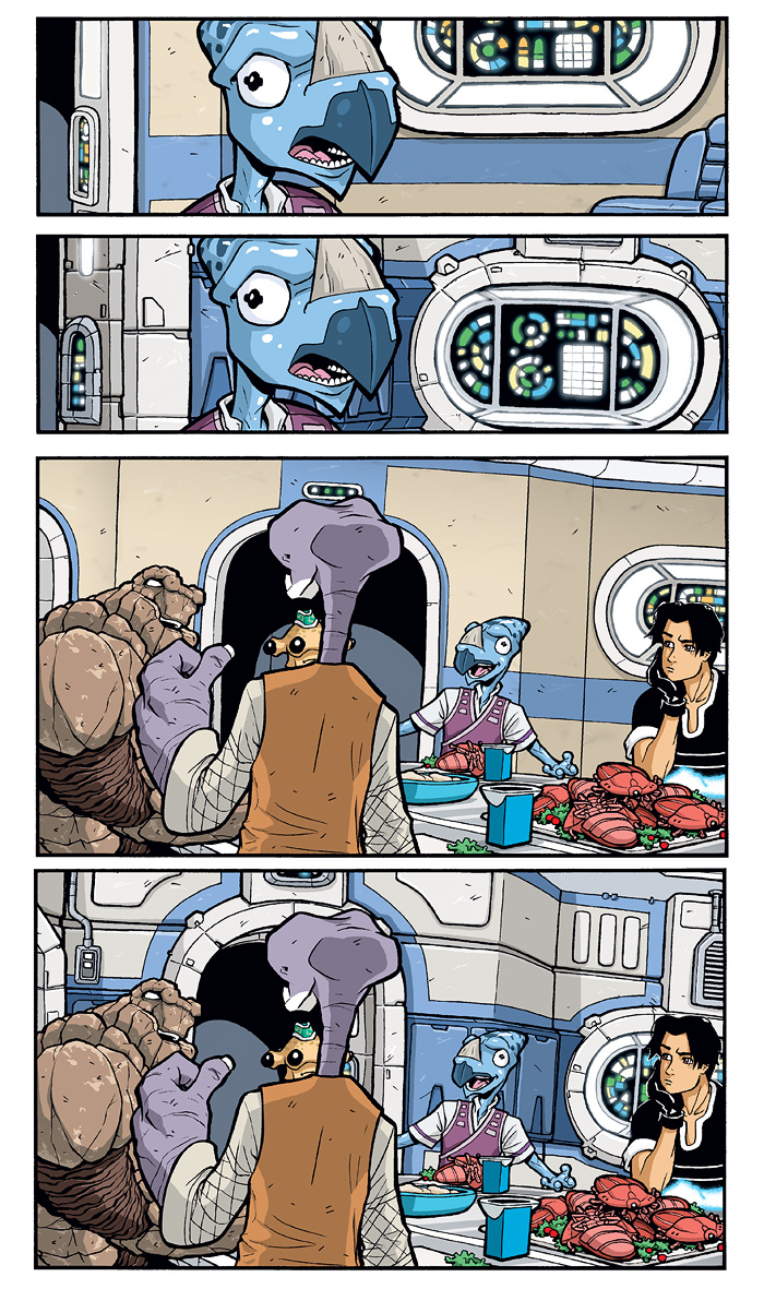
This page shows two panels from that sequence, comparing the old versions with the revised versions. As you can see, the old ones just felt a bit too stucco-y and plain. There wasn’t a lot of geometry breaking up the large flat surfaces, and the trimwork around the doors and consoles was too thin.


It matches the outside a lot better now. Though there might be a use for the old style bulkheads, that being if Roka put in a non-standard bulkheads to close off a new space – like Cember and Bennesaud’s room on that deckplan. Or use different colors to denote he got them from the same make of ship, but that they were not original parts. I definitely like these detailed walls though, you enriched the scene immensely without making it look cluttered.
the original look more like a house than a space ship
I think both approaches are fit for a spaceship or space station/house interior.
The added details, while impressive, just make the room look heavier.
I would buy the fact that the interior would be less bulky in order to make the ship lighter and faster.
Of course you could counter that by saying that the bulk helps the space ship be more durable for long travels and attacks.
Also, a dinner scene is more likely to be associated with a house.
This remains true for both approaches I think.
For me it is the colors you used that makes me think of a house (first, less detailed version) and a space ship (second, more detailed version).
Potato, potatoe. The color and design of the 2nd version is more thematic, FWIW.