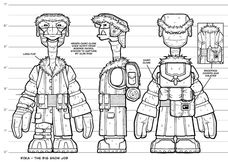
BONUS CONTENT: Roka Turnaround
For Roka’s snow outfit, I wanted to stick with his established style of elongated vertical shapes, so I gave him a long coat with vertical banding to accentuate the length. The pouches on his belt also have long flaps to continue the motif. I threw in the horizontal bands on the sleeves to break up the verticals a little and also because I just thought it might be an interesting look to have these slight bulges of fabric between each band on the arms.


This is awesome! It looks like schematics for an action figure. 🙂
Action figures. Oh, how awesome that would be. Sigh.
Well, if the opportunity ever arises, I’ll have these character schematics ready to go!
Oh, then you should have made Roka 6.5″ instead of 6.5′ in this picture 😉
Only now, looking at this turnaround, do I wonder how Roka got that skinny turtleneck over his comparatively huge head. Reminds me of the Seinfeld “stretched neckhole” episode.
Nice post. I have a few questions regarding these turnarounds you make.
1. If the arm of the center figure is required to be drawn (because it has an emblem or something that is only visible from this POV) will you than draw the arm separately or add an extra full figure with arm in place?
2. If you have to draw a considerably larger character like Bennesaud, do you draw him as large as Rokka and adjust the scale on the left or do you keep the scale and draw him larger?
Interesting questions. I’m kinda making things up as I go along since I haven’t really done too many of these turnarounds. In fact, I only did them for Roka, Sky, and Bocce for this story arc. I was going to do them for the Ril, Cember, and Bennesaud snow outfits as well, but decided instead to jump into the pages themselves. I might finish those anyway for these Bonus Content features though. Assuming people would be interested in them.
As for the extra side view of the arm, if it were just a shoulder detail, I might do an inset panel like I did for the backpack/holster view. For a full arm, I’d most likely do it as a separate element next to the body.
As far as scale goes, I’ve been scaling the characters to the actual paper. So each character gets the 3 views horizontally on a sheet, making them all look about the same size on paper. I then add the height markers adjusted for each character to show their actual relative differences.
Thanks for the answers.
I was trying out a few turnarounds myself and was using the Marvel ones as a template.
Yours was different and I think adding the scale, leaving the arm of for the side view and the separate element sections are improvements.