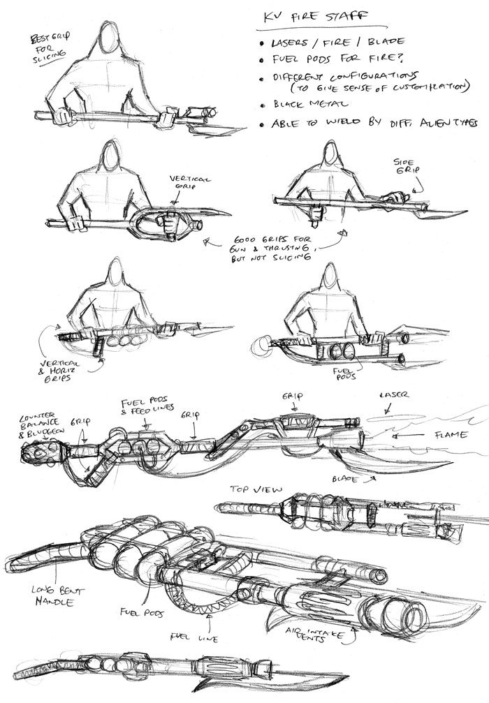
Here we have sketches for the Kaagan-Vas weapon of choice: the firestaff, as described in the Commentary for The Big Snow Job #4, Page 12. Part blaster rifle, part flame thrower, part stabby-stick, and all fun. I knew going in that it would be a really big and cumbersome weapon, but I also like it for that reason as it enhances the bad-assery of the Kaagan-Vas. Basically, it’s a big, heavy, manly weapon that most others wouldn’t even want to try to pick up, let alone carry around into battle.
The idea was for it to be a heavy weapon that you carry low, somewhere around the waist. So it doesn’t have a gun sight and it’s not used for precise shooting like a sniper rifle. It’s more of a beast meant to inflict maximum carnage and firepower, kinda like the big guns used by Vasquez and Drake in Aliens.
The design of it was pretty tough since I wanted the user interface to fit with how it would actually be employed. Basically, some ways of holding it worked well for the rifle/flamethrower aspect, but then felt awkward with the blade slicing and/or thrusting motions. In the end, I think the secondary grip spanning the two barrels perpendicularly seemed to work best since it can be used to shoot, thrust, and slice with the least amount of awkwardness in any of those actions. And the grip also separates the two barrels a bit since you probably don’t want the flamethrower parts and blaster parts right up on each other.
I find it kinda funny that in one of the sketches, I even added a bludgeon to the back end. Because three weapons in one isn’t quite enough. Sure, you can shoot someone, set him on fire, and cut him up. But what if you really want to beat him down too? Well then your weapon is just lacking a little bit.
Anyway, with all that being said and all the thought that went into the design of the thing, you never actually see the KV firestaffs in any real detail in the sequence! Yay! Time well spent.
