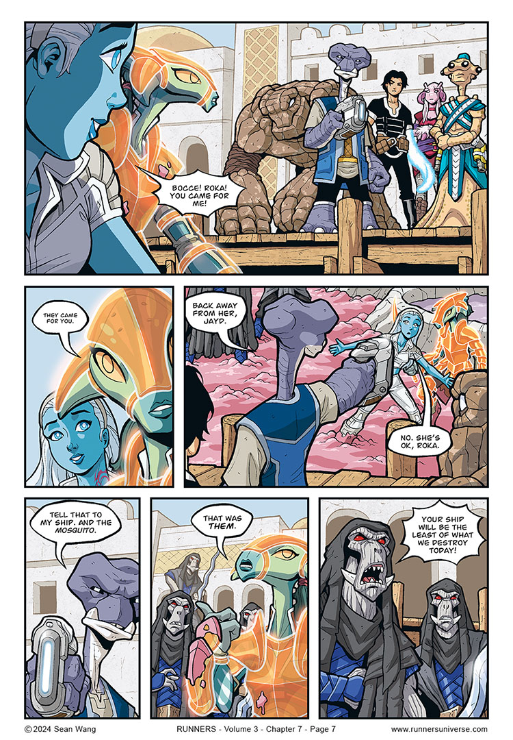
The cavalry arrives!
I think the font size in panel 2 could probably be a tiny bit smaller, since it is Jayd speaking more to herself than to Sky. Maybe I’ll change it for the graphic novel printing.
I like this little moment of her being genuinely surprised and happy for Sky to see that she was wrong in thinking they’d leave her behind.


Hail! Hail! The gang’s all here!
I wanted to write that this is my favourite page of the volume, but a few others came to mind right away.
The difference in font size was clear to me right away, as well as why it is smaller.
Nice! It’s always cool to think people have multiple favorite pages. Gonna be fun to finally have this one in print.
There are different ways to represent a speech in low-voice: A smaller text with more white space than usual inside the balloon is one of these.
Another one can be to represent the text in grey, instead of black, but I think in this case, the other method worked fine!
I do like the first approach and use that fairly regularly. I have seen the gray text on occasion but sometimes that feels like a printing error, which is why I like the other technique more. But it’s fun to see what other people do for lettering effects.
A lot of time ago, the whispered text was represented with a balloon with dotted lines, but it’s too … old-style … The important is that the chosen method is consistent through the whole story. 😉