BONUS CONTENT: Art Process Display Banner, Pt 6 (Shade) & 7 (Space)
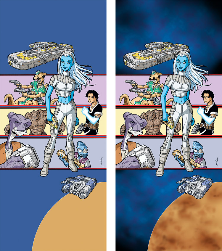
Now we’re into the fun part of the Coloring stage: the shading and highlights. In the left image, I added the shading on all of the main art, namely the characters and ships. With that done, in the right image, I started working on the background elements of space and planet. At this point, coloring characters is pretty easy and straightforward, but I knew the space background would be a bit more work and require more layers and experimentation. Having done a few colored space backgrounds before for the series, I knew I’d want to lay in some Cloud effects (a Photoshop filter) as a starting point.
Next up, more Space and Planet layers…


Great job on the shading.
When using (Photoshop)filters for the background one of my concerns is the end result not mixing well with the hand drawn objects. Is that something you also take into consideration when you use filters?
Definitely! I really like the semi-cartoony, cel-shaded look of the series, so I’m very wary of using too many effects. I don’t want anything to look too “rendered” or “airbrushy” and I also realize that a lot of Photoshop filters are pretty immediately recognizable. So I try to minimize all that. In this case, as you’ll see in the next post, I add a bit more artwork on top of the space areas, so the cloud filter isn’t really all that visible in the end. It’s just the foundation.