BONUS CONTENT: Art Process Display Banner, Pt 2 (Pencils) & 3 (Inks)
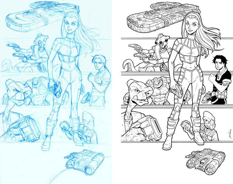
FYI, the final banner image has a very long vertical dimension, so rather than post obnoxiously long vertical images, I decided to double them up, to make the overall image more squarish. So lucky you, each week you’ll be getting two for the price of one!
Here we have the pencil and ink stages. As you can see, I went with my favorite layout from the previous Thumbnails post, but I switched Roka out for Sky as the central figure. I did it because (a) she will become increasingly important to the central story of the series as it develops, and (b) it’s always nice to have an eye-catching cute female character front and center. It definitely seems like comic fans (both male and female) love their female characters, almost as much as most artists seem to enjoy drawing them. So I guess everybody’s happy! Well, except Ril, who ended up stuck behind her ankle. Sorry, Ril.
As a compositional consideration, I deliberately wanted the character on the bottom left (which ended up being Roka) to be the largest of the background characters. I knew the bottom would be very close to the eye-line cut-off once the banner was set up behind a convention table, so I wanted to make sure there was something a tad bigger to “mark” that edge of the main image. So all the characters are visually bracketed vertically between Roka and the Khoruysa Brimia. I think if Roka were smaller, it would have felt like the art was just “running out” towards the bottom and not “contained.”
Random note: the image obviously isn’t meant to be scene specific, but eagle-eyed readers may notice that they’re all wearing their outfits from the Arqq-Olem port and the root beetle dinner scene from The Big Snow Job #1. Basically, I was in a major time crunch and didn’t feel like designing all new outfits just for this one image. And I really liked all those Arqq-Olem outfits, so I figured, why not?
Next up, resizing and color flats…


Funny to see Sky ‘battle’ Roka for the spotlight in the sketches and actually taking it in the final version.
I like the composition.
Enough room to display each character/vehicle and the lines provide clear sections without being overly present.
Nice poses for each of the characters.
Not too sure about the amount of guns though as not all of the characters need them. They fit best with Ril and Cember.
Bocce has his arm to ‘show off’, while Bennesaud and Roka’s looks are interesting enough to stand on their own.
As for Sky. I wonder if it would have been possible for her to display some of that hidden strength she has.
Like when she bended the fork in that dinner scene. Perhaps crushing a small rock with her right hand?
Yeah, I think I agree with you on the guns. As I mention in the commentary above, I was in a bit of a time crunch, so I whipped this image out (from pencils to printer) in just a couple days. Had I sat on it longer, I might have decided to reduce the number of guns, but at the time, I figured it would really add to the action-y look of the banner to have everyone armed and ready to rock. In doing the piece, I debated only whether or not to have Sky holding a gun. Ultimately, I thought it would be weird to have the only female singled out as unarmed, so to even things out, I threw one in her hand as well.
BTW, the planet at the very bottom of the penciled page also has a gun, but it’s hidden behind its back.
A gun behind its back? This must be Ril’s home planet! 😀
I’ll bet it has a “nuclear” radioactive core too – for those pesky invasions that you can’t get rid of.