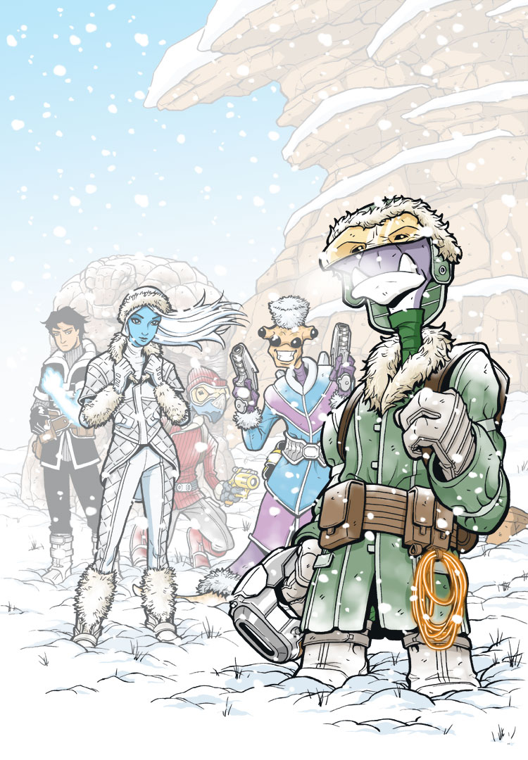
BONUS CONTENT: Art Process “Snow Job” #1 cover, Pt 6
So this is the last step of this cover’s Process feature. From the previous steps, everything is colored the way I want it and the mist layers now establish a cool sense of atmosphere and space to the image. Here I add a few extra effects and details to really help sell the piece.
The biggest discovery for me was that the characters looked a bit fake and out of place in the previous image because they didn’t seem like they were truly interacting with the environment. They were just a bit too clean. I found that adding a bit of snow dusting on their lower legs and head and shoulders made it really look like they were in the snow.
I also added some visible breath to Roka to give the setting that really cold look. The hot rope on Roka’s belt also gets finished here. As a glowing object, I replaced the black outline with an orange color hold to make it look less “solid.” I then just added a slight orange glow to it, as well as a white highlight glow running along the center of the rope. Along those lines, I also replaced Bocce’s arm with his glowing blue energy arm. For his arm, I use the Airbrush tool in Photoshop set to Dissolve. I find that gives it a nice spatter look that makes it read more like crackling energy.
Lastly, I add a layer of falling snow over the entire image. As I mentioned in the previous post, sometimes it’s hard to cover up all that finished art you’ve worked so hard on, but in the end, the final image is worth it since sometimes the obscuring bits are what really sells the piece.
So that’s it! I hope you enjoyed the multi-step process of this cover image. The next time I do one of these, it will be for a full page of paneled artwork, possibly with some color tints, so that should be really interesting…


how do you get your lines to come out so solid and smooth? i’ve been trying to work on my drawings in photoshop, but the ink looks very light once a scan it and when i use my sketch pad to fix it they get bumpy and messy. any suggestions?
Hmm. Sounds like it could be a resolution problem? For my work, I pencil and ink on 11×17″ bristol board and then scan the artwork in to finish the coloring and lettering digitally. In the scanning process, I scan the page as lineart”(as opposed to RGB or grayscale) at 450dpi and 67% of original size. That generally gives me a high enough resolution to work with that will look good in print. Of course for web images, I make a copy of the final art at a much lower resolution (72 dpi) and the anti-aliasing keeps the lines looking smooth. Hope some of that helps.